A responsive website redesign for Ansar services of the Greater Washington Area.
Figma, Adobe Photoshop, WordPress, Google Docs, Google Analytics
UX and WordPress Designer
Product Owner and feedback from other Stakeholders
5 WEEKS
In the heart of Greater Washington DC, Ansar Services is a Non-Profit dedicated to uplifting underserved communities. With a mission centered on empowerment, Ansar offers online IT Skills Development and interactive Self-Leadership Training to foster growth within minority populations.
I’m on a mission to redesign the Ansar Services website. My job? Make it crystal clear what Ansar is all about – helping underserved communities. And guess what? They are looking for a responsive design that flexes its muscles across devices, giving visitors an unparalleled experience. So, when the website is ready, it will be intuitive and user-friendly, getting visitors to donate, volunteer, or sponsor programs.
I started by really getting to know the organization and the end-users. I chatted with the product owner and business stakeholders through interviews. It was like peeling back the layers of an onion – I learned about their mission, who they’re trying to reach, where they stand currently, and where they want to go in the future before I dive into the design process. These are some of the insights that stood out:
We need a refresh of the website, to attract more donors and volunteers who want to support our mission.
We are now aiming at young adults between the ages of 17 to 24 who are seeking opportunities in “In-Demand” and emerging jobs, including the IT fields.
We want consistency in design and language that speaks to our audience.
Change in direction: Focusing on Youth Development to Workforce Development
Based on the insights, I created personas that represent the target user of the Society and their needs and frustrations. By creating these user personas, the website can tailor its content and design to address its target audience’s specific needs, frustrations, and goals.
Because of budget and time constraints, I decided to conduct a UX audit on the website, using Jakob Nielsen’s Heuristic Evaluation to identify design problems in the user interface.
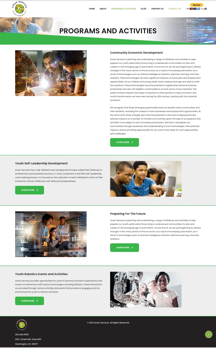
After I took a fresh look at the entire website, it’s time to implement our recommendations. One of my key proposals was streamlining the website’s high-level Information Architecture (IA). This move helped us eliminate unnecessary duplicate pages, making the site more efficient. So, it’s about time I dive into the design phase and start creating some wireframes.
Regarding the navigation, I decided to trim down the list of submenus under the “Activities and Programs” menu. I narrowed it down from five to just three. This way, I focus on the sections that matter and contribute to our objectives. It’s all about streamlining and making the user experience as smooth as possible.
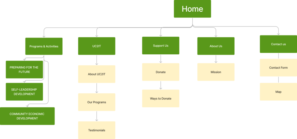
Once I figured out the primary user task and flows, I created some basic wireframes and got real users to test them. This early feedback was helpful and saved us time before diving into the fancy high-fidelity stuff.
So, here’s how the design process went down: After getting feedback on our wireframes, we hit a few bumps in the road. There were discussions about what content should stay and what should go on the website. We also had a bit of back-and-forth on choosing the perfect images that captured our goals.
But after hashing it all out and finding common ground, we had a clear picture of how to present the content in a new and improved way. With those decisions locked in, I created high-fidelity mockups and interactive prototypes. It’s all part of the journey to make our design top-notch!
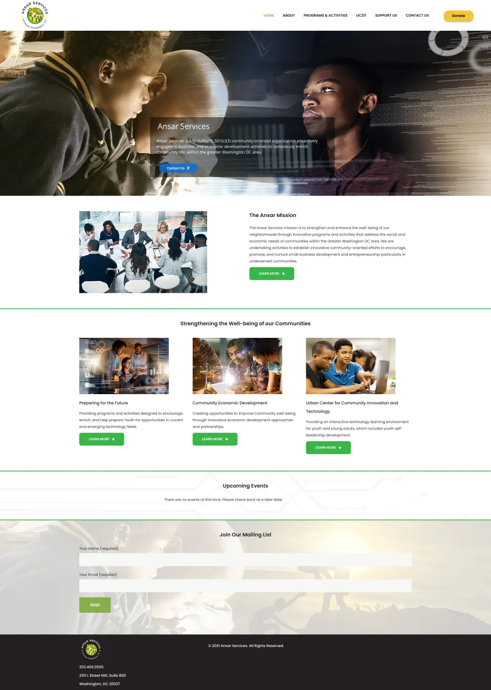
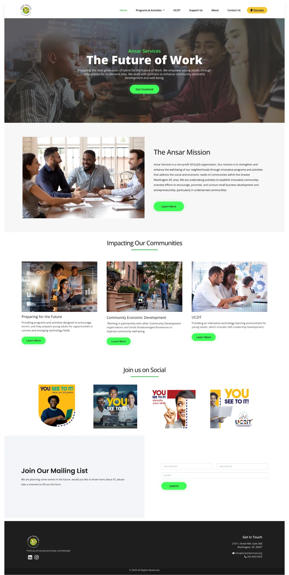
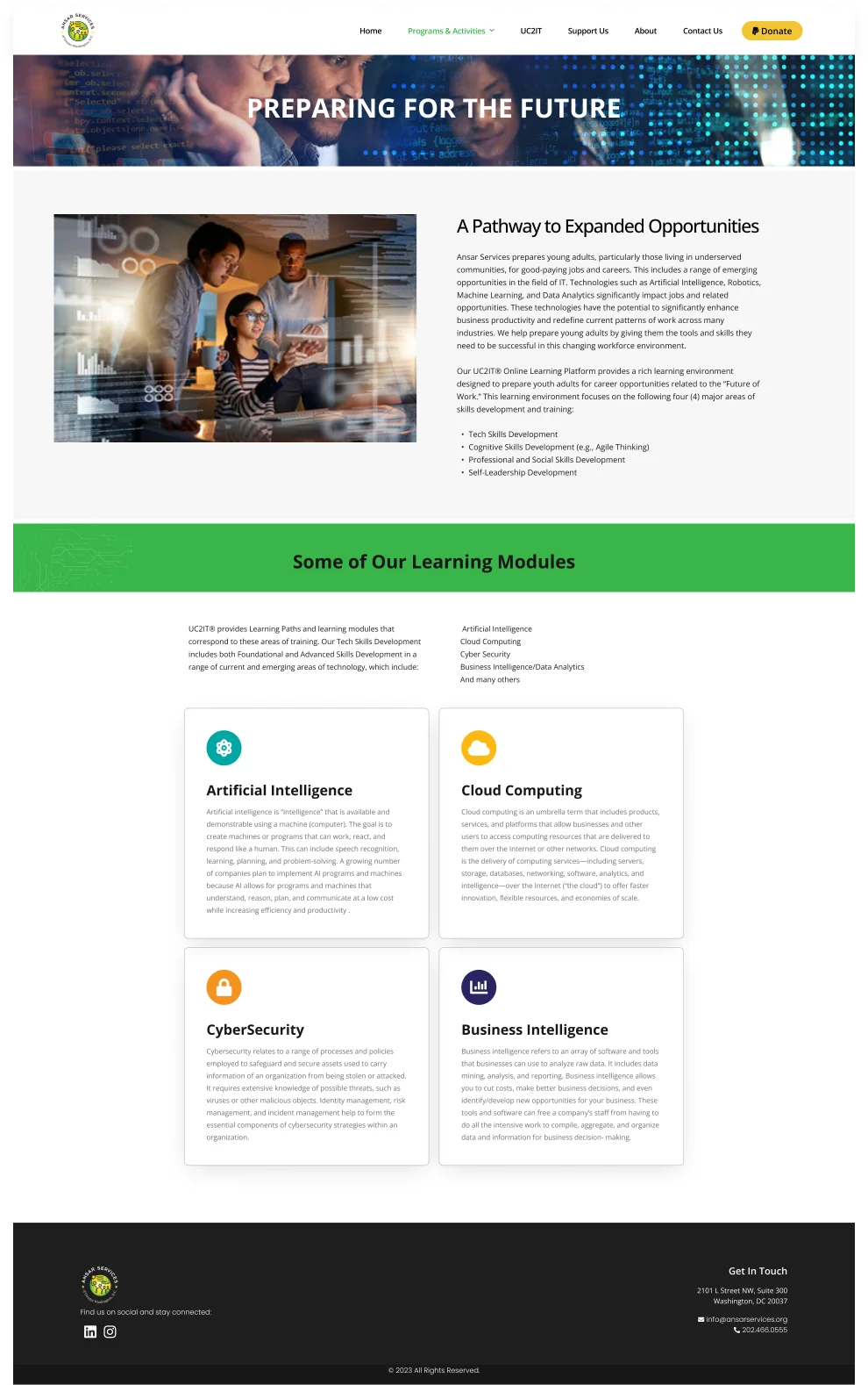
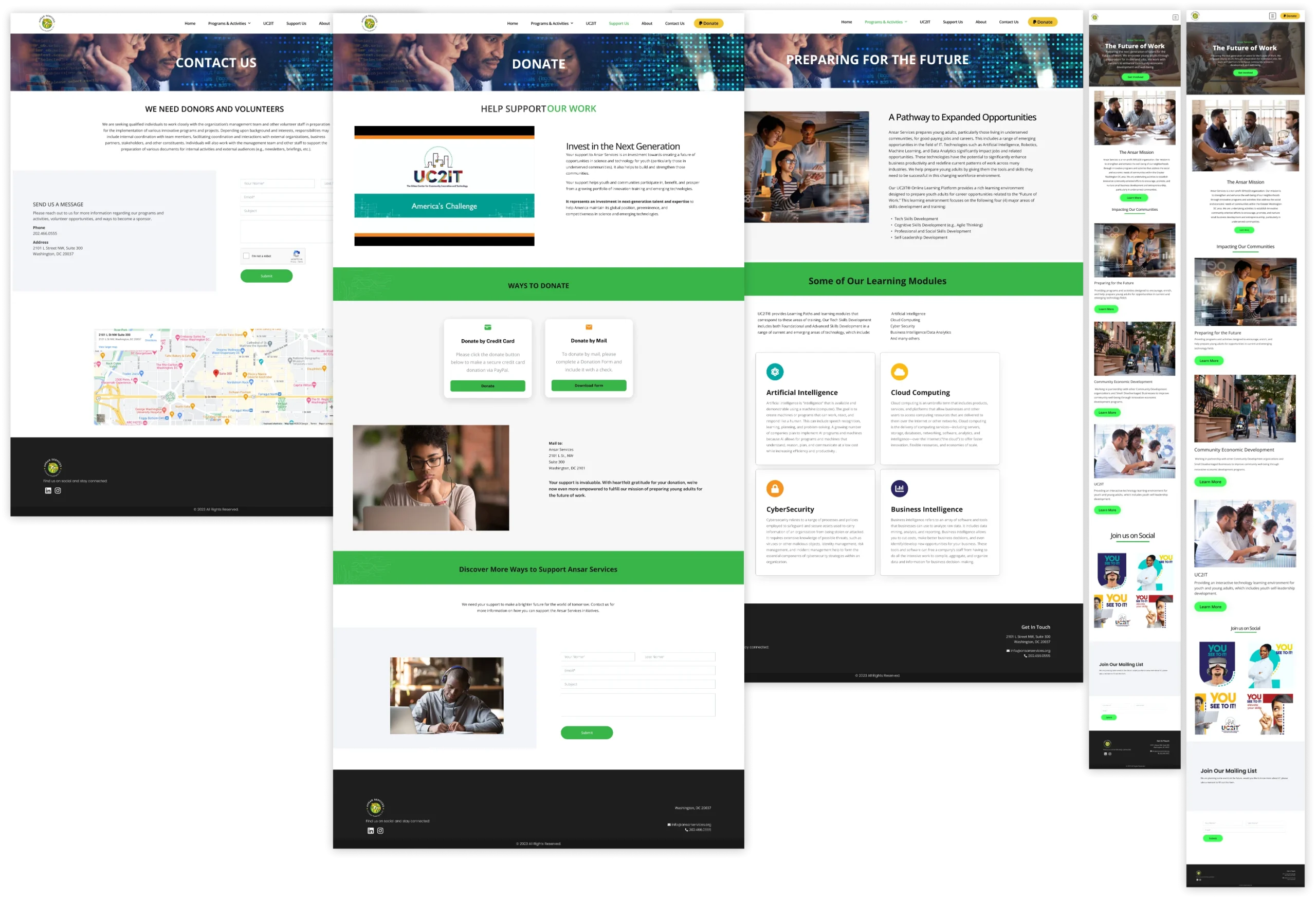
So, when it was time to get some honest feedback from both our clients and potential users, it was a bit tough. After I presented the design, it turned out that everyone had something to say. Some weren’t too thrilled with the images we chose, and there were mixed feelings about the call-to-action buttons.
Then, there was the “Join Us on Social” section, which some participants felt was a bit distracting from the main content on the homepage. And, of course, the consistency in the layout came up as a point of discussion.
It’s all part of the process – taking those hard-to-swallow pills and refining our design to make it the best it can be.
When it came to the development phase, I made my way over to WordPress. Using the high-fidelity mockup I created as a guide, I started bringing the design to life. It’s like turning our visual concept into a fully functional website.
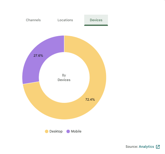
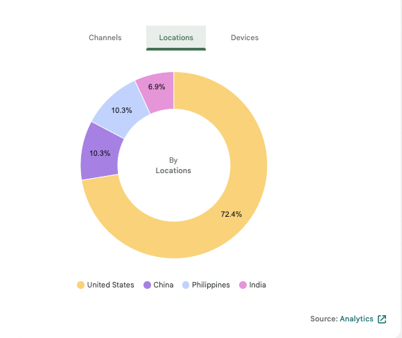
Once I had the design up and running in a series of sprints, it was time to watch how it was performing. I hooked up Google Analytics to the website and started gathering data.
Most visitors hit the homepage, the “Support Us” page, and UC2IT. These areas are the hotspots, and they play a crucial role in helping Ansar Services meet its goals. It’s all about using data to understand what’s working and what I need to work in the future.

When we look at the impact of our work so far, even with the limited data we have, it’s clear that the website is heading in the right direction. Our goal of attracting more donors and volunteers to support our mission seems to be on track.
One thing I’ve learned in this design process is that it’s a dance. It’s dynamic and can have challenges– dealing with time constraints, resource limitations, and gathering feedback. It often involves going back and forth through iterations to create a functional and desirable user experience.
So, what’s next? Well, we need to keep pushing to make our designs accessible to everyone and ensure the user interface is not only visually appealing but also user-friendly and engaging. And, of course, we’ll need to continue iterating and conducting consistent usability testing to fine-tune the user experience. It’s all part of the journey to create something great!