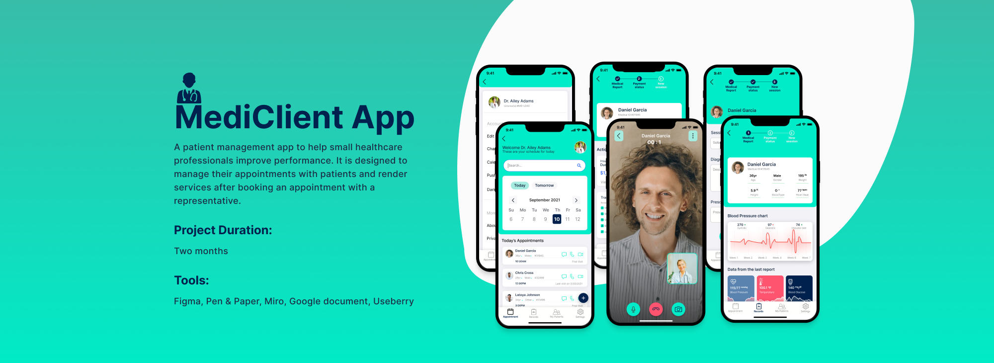
In this pandemic and remote work period, healthcare professionals want an easier way to connect with patients anytime.
The Goal:
Design an app to help small healthcare businesses manage their schedule from the couch.
My Role:
UX researcher, UX Designer and Visual designer
Responsibilities:
Conducting user interviews and research, paper and digital wireframing, low and high prototyping, conducting usability studies, accounting for accessibility, and iterating designs
Understanding the user
User research
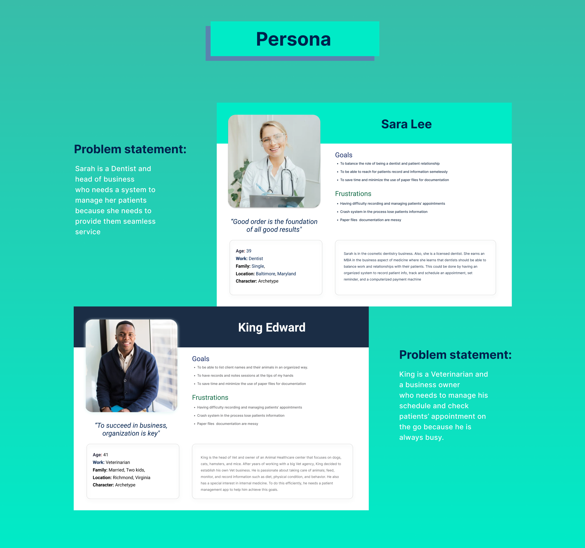
Personas
Problem statements
User journey maps
METHOD: Interview
To start the project, I conducted interviews with a few healthcare professionals to gain a deeper understanding of the problem. During the interviews, I inquired about the pain points they experience while attending to patients, and what they think can be improved, and asked many “why” questions to get to the root of the problem.
User research: summary
This user research helped me to understand and identify users’ pain points and needs. The primary users are healthcare workers who want an easy way to record Patients’ info, track, and schedule appointments, and set reminders.
This changed the early assumption that hospitals needed a calendar and database system to store patient records.
User research: pain points
Desktop version:
Most CRM for healthcare businesses are only in the desktop version.
Technical to use:
Most available client management systems are complex and challenging for those with little knowledge of computers.
No customize app:
Most Client management apps are for many purposes and industries, not only for hospitals.
Mixed up appointment:
I find it confusing to monitor and follow up with appointments.
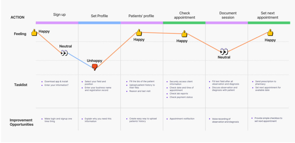
User Journey Map
Mapping Sarah’s User journey revealed how helpful it would be for users to set appointments and record sessions using this app in a hospital setting.
Starting
the design
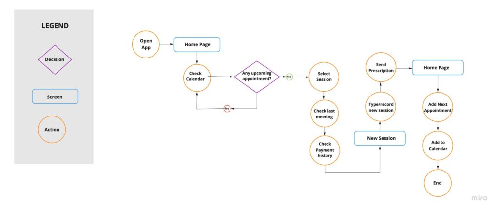
User Flow
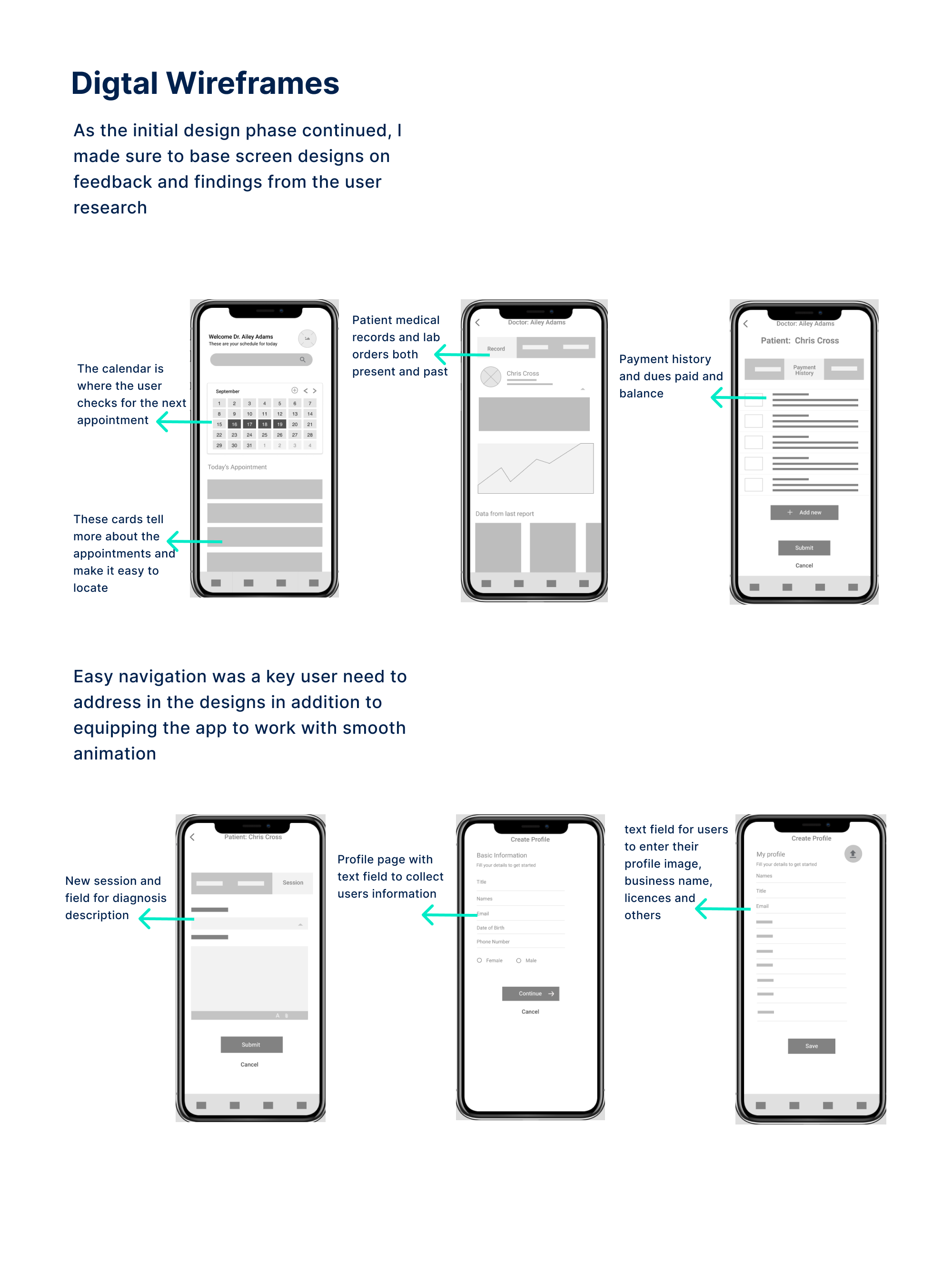
Paper / Digital wireframes
Low-fidelity prototype
Usability studies
User Flow
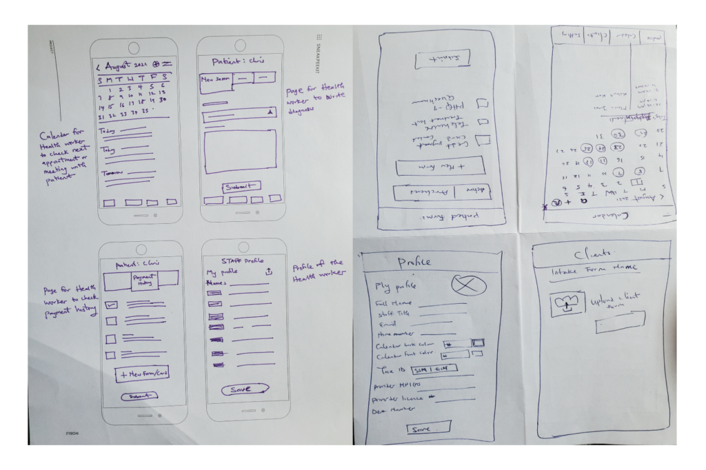
Paper wireframes
I created paper wireframes to come up with many ideas. An easy way to make the user check appointments and attend to patients on the app. All the UI elements that would be used for digital wireframes are present.
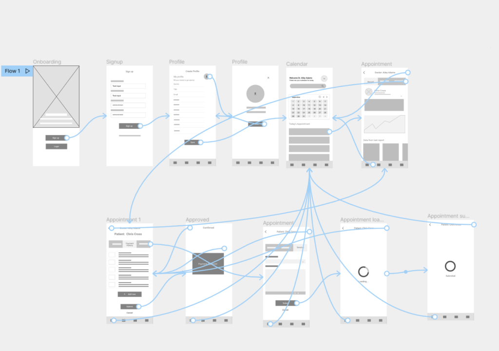
Low-fidelity prototype
The low-fidelity prototype connected the primary user flow of signing up to attending to patients and adding staff members to the app to use the prototype in a usability study with users.
Usability study: findings
This unmoderated usability study was conducted among five participants of diverse backgrounds in the healthcare field.
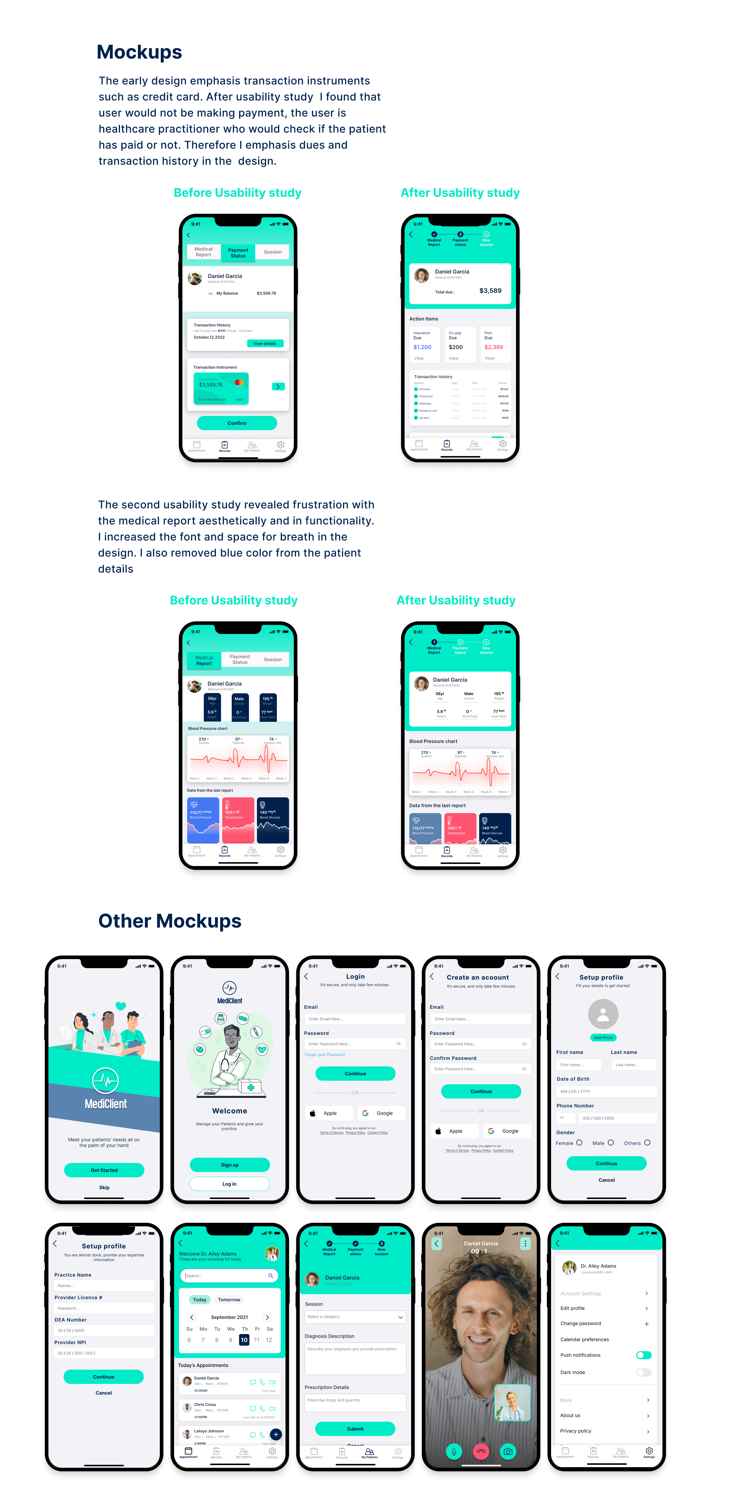
Round one findings
Users need a more intuitive way to check payment history.
Users need better cues for what steps to follow to check patients’ health records.
Users want better cues on how to use the calendar.
Round two findings
The progress indicator is too dominant
The payment status is still not intuitive enough
“ Medical report” functionality is confusing.
Refining
the design
Mockups
High-fidelity prototype
Accessibility
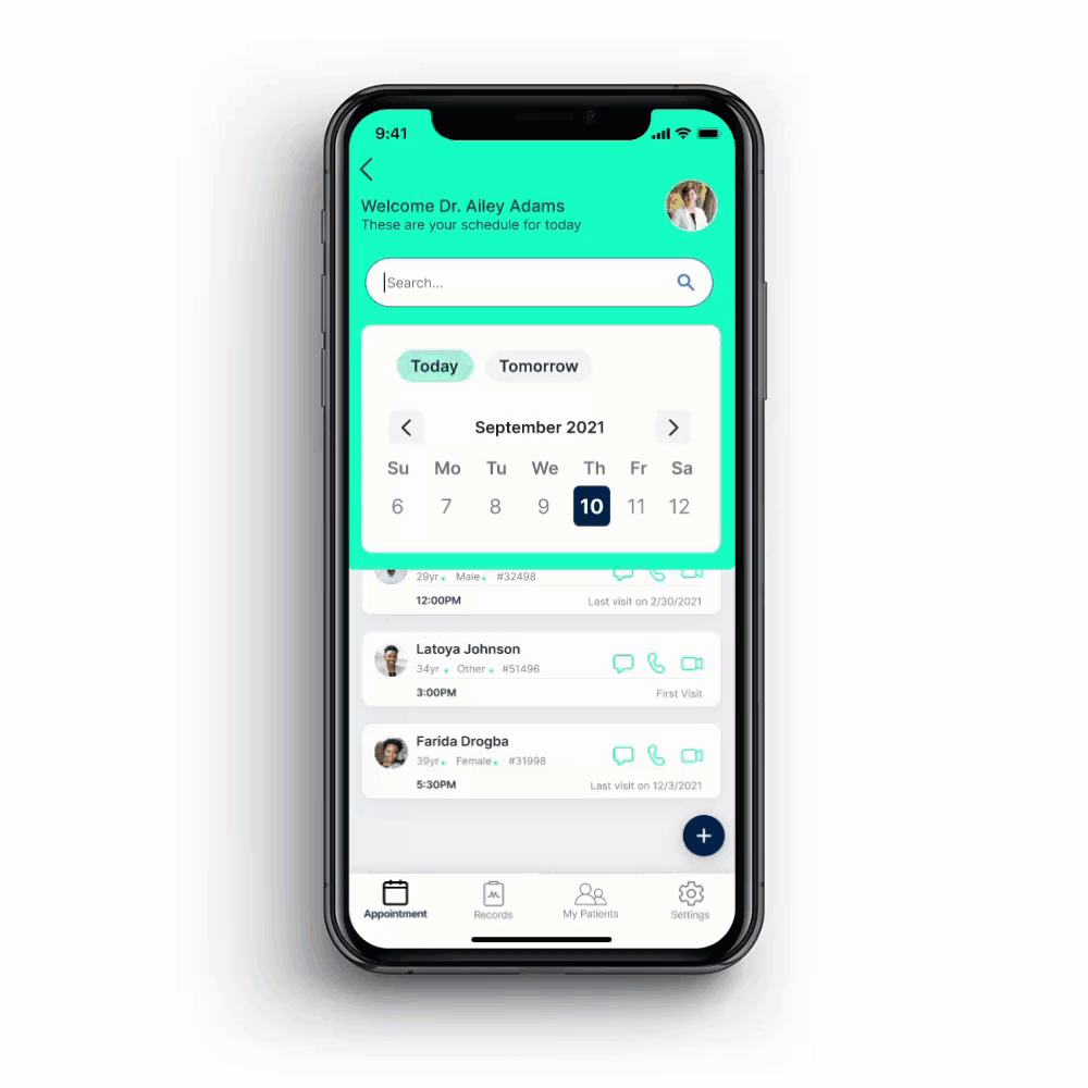
High-fidelity
prototype
Accessibility considerations
Used Icons to help make navigation easier.
Used detailed imagery such as illustrations and charts to help users better understand the designs.
Ensured enough color contrast, visible type, and white space for breathing space.
Going forward
Takeaways
Next steps
Takeaways
Impact:
This app would allow small healthcare professionals to meet the needs of their patients fast.
One quote from peer feedback
”The App is a quick way of attending to Patients on the go.”
What I learned:
While designing the Mediclient app, I realized that the design process is not linear. But circular that requires back-and-forth iterations to create functional and desirable experiences.
Next Steps
Continue to look for ways to make the designs more accessible to everyone and ensure the UI is visually appealing.
Conduct another round of usability studies to validate whether the pain points users experienced have been effectively addressed.
Conduct more user research to determine any areas of need, and introduce other features like an instant chat between doctor-patients.