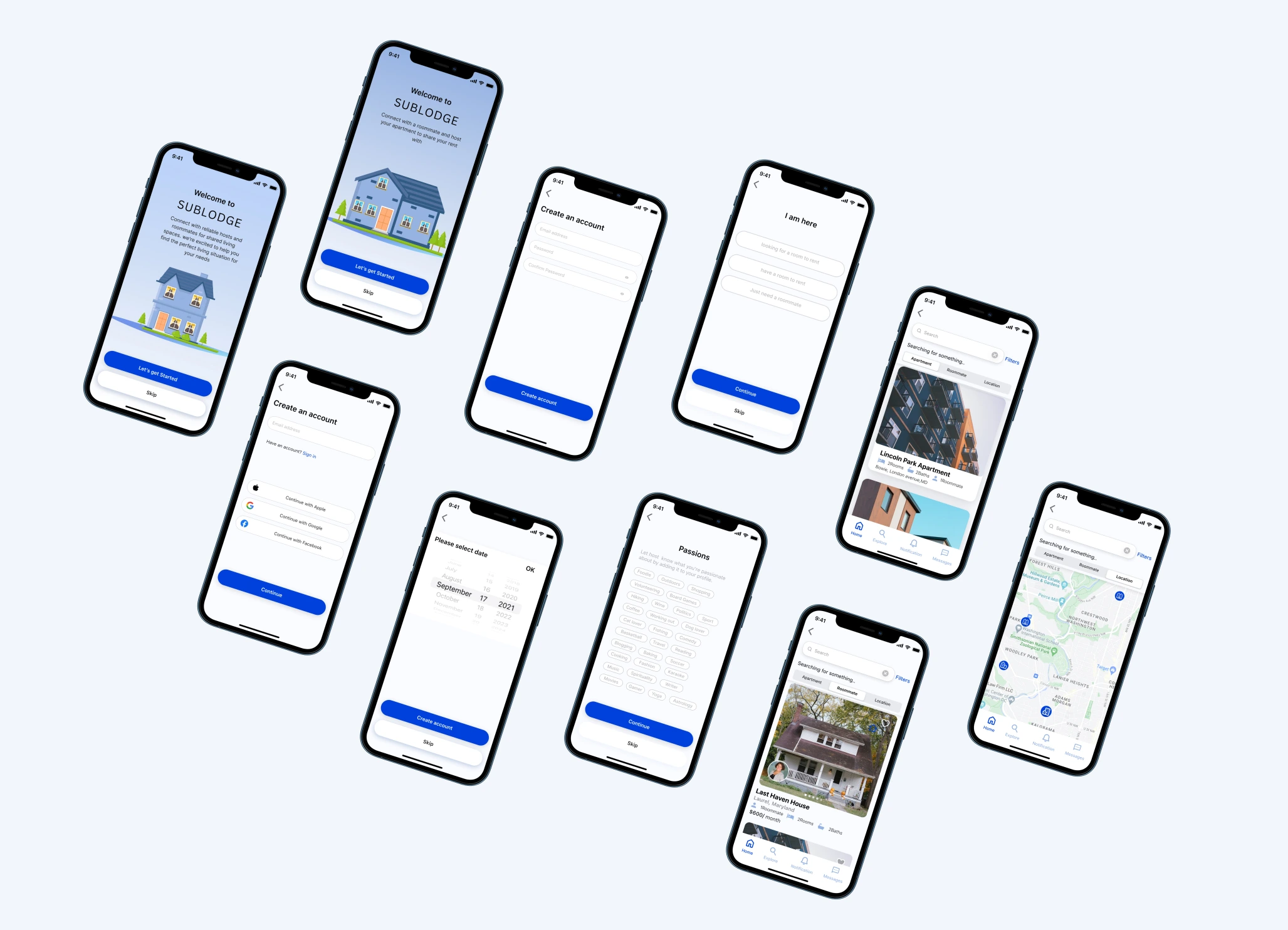
An app that connects potential immigrants with like-minded roommates who share interests, hobbies, and lifestyle preferences.
Figma, Adobe Photo, WordPress, Google Docs, Google Analytics
UX Designer (Research, Visual Design, , Usability Testing)
Self Directed, with feedback from the mentor and peers
5 WEEKS
This project has an interesting backstory. It all started with the AIGA DC SHINE 2023 program, where mentors and mentees came together to work on a Social Good Project. Our topic was “Homelessness Among Immigrants,” and from this program, Sublodge was born. Let me walk you through how it all came together.
You know, immigrants often encounter some pretty tough hurdles when it comes to finding a place to live in a new country. Especially for those who don’t have family support, have limited funds, or are missing the right paperwork to rent a home, the harsh truth is that they face a real risk of ending up without a place to stay. It’s a challenging situation, and I aim to address that.
In my design process, I kicked things off with some contextual interviews. I talked to new immigrants to really get a handle on the challenges they face, especially when it comes to finding a place to live here in the US.
Here are the key takeaways from those interviews:
Participant A mentioned needing good credit or a guarantor to rent an apartment. Her main hurdles included employment, job hunting, finding a place to live, and transportation.
Participant B had a fascinating insight. She was referred to look for a roommate on Craigslist, but she was concerned about security when living with strangers. She wished there was a way to know more about potential roommates, like their preferences and backgrounds.
Participant C briefly stayed in a hotel and used temporary accommodations when she first arrived. She believed immigrants should have access to rental assistance programs, similar to Section 8.
Participant D also mentioned using online communities to search for housing and stressed the importance of detailed information and pictures when looking for roommates through an app.
I have learned a lot about our target audience—their goals, their needs, you name it. To make things crystal clear, I like to create user personas. These are like friendly stand-ins for different types of users. They help me zoom in on the significant issues and tackle the most pressing problems, especially for those user groups who matter the most.
To define the problem, I generate How-Might-We (HMW) Questions to frame the ideation in the brainstorming session for solutions. I then use the Feature Prioritization method to choose the best feature that would benefit the end users.
Once I have figured out which features I will include, my next step is to keep shaping how users will move through the Sublodge App and organize all the information. It’s like creating a roadmap to make sure everything makes sense and is easy to find.
After I took a fresh look at the entire user flow, it’s time to implement our recommendations. One of my key proposals was streamlining the website’s high-level Information Architecture (IA). This move helped us eliminate unnecessary duplicate pages, making the site more efficient. So, it’s about time I dive into the design phase and start creating some wireframes.
After finishing the low-fidelity prototypes, I carried out usability testing on the Usaberry platform. This testing provided me with a diverse range of feedback. One of the main takeaways from the feedback was that users wanted to be able to browse apartments and learn about potential roommates before they signed up for the service. This was a valuable insight, as it highlighted the importance of providing users with information about their potential roommates. Doing so can help them make a more informed decision about whether or not they want to live together.
After reviewing user feedback and conducting usability testing, I analyze the pain points and areas of confusion that users have expressed. I also take into account the need for more details about potential roommates and apartments, as well as the importance of improving navigation and enhancing the overall user experience. Based on these factors, I prioritize the changes that will have the biggest impact on user experience.
Once I am satisfied with the low-fidelity iteration, I transition to designing high-fidelity mockups using a tool like Figma. This allows me to translate refined design concepts into a polished visual representation.

This project has been a delightful experience for me, highlighting the importance of collaborative brainstorming in crafting exceptional user experiences. While working on this project, I encountered a significant challenge in identifying and engaging the appropriate interviewees.
Looking ahead, I aspire to explore the realm of accessibility further and delve into the implementation of features that facilitate optimal roommate connections. I aim to enhance user experiences by focusing on these areas, ensuring individuals find suitable roommates and establish meaningful connections in their living environments.