Role: UI UX / WordPress Developer
Tools: Figma, WordPress, Google Docs
Duration: Two Weeks
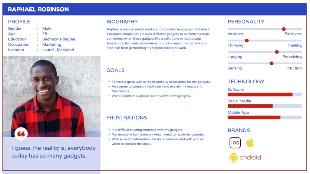
WTL Wireless Solutions is a company that offers a range of mobile phone deals, including contract, prepay, and sim-free options. They also provide mobile phone accessories, mobile broadband, and cell phone repair services.
Our objective is to create a website that informs potential customers about our products and services, while also providing a platform for interacting with them about our company’s identity, offerings, scheduling, location and pricing.
In the future, the website will allow customers to purchase our products and services online. As a UX and website designer, I am responsible for enhancing customer experiences across various product lines on both web and mobile platforms.
Interview
I conducted interviews with the Owner of the business and customers to understand the goals and challenges of the project. The interview aims to learn about their day-to-day process, what the customers want to know to make a buying decision, use cases, and identify their pain points. Interviews were conducted via MS Teams as representatives are social distancing.
Key Questions
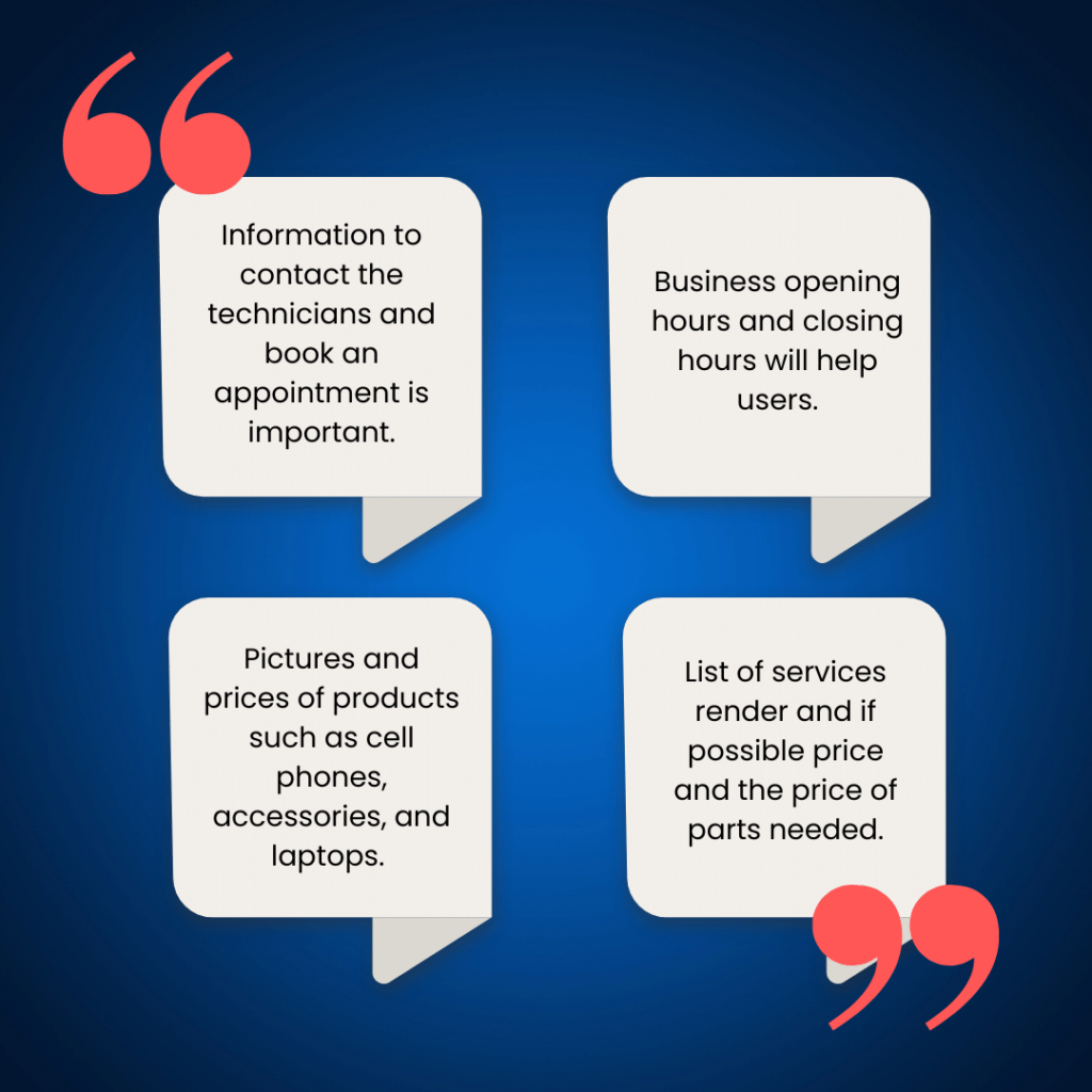
Competitive Analysis


From my findings, I discovered that the business needs a responsive website to reach its target market. An engaging website that displays contact information for various services the company provides.
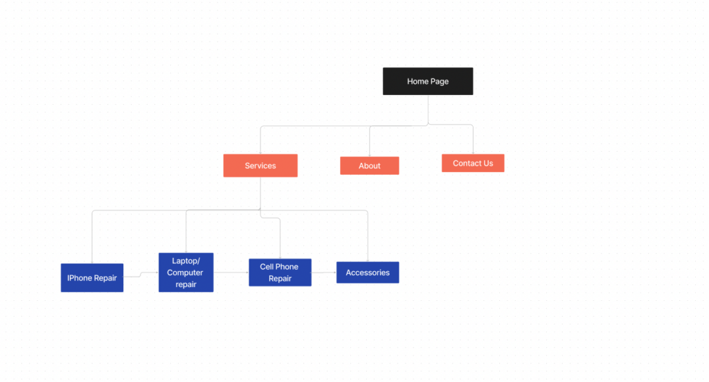
I created a quick rough sketch of the homepage wireframe — I wanted the homepage to focus on important elements of the entire site. I make sure the Nav bar is easy to locate and understand. I use a carousel slider for the hero section of the homepage to show different services the business offers.
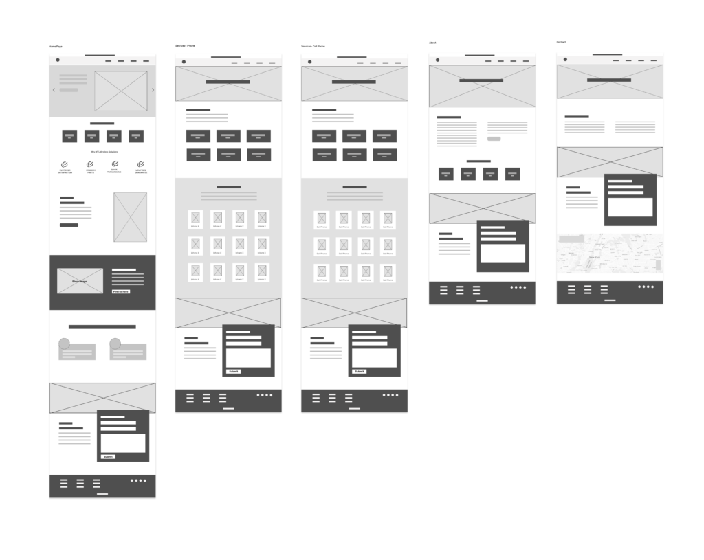
The high-fidelity design was designed with the users in mind and emphasizing responsiveness, aesthetics, and usability to foster a great experience.
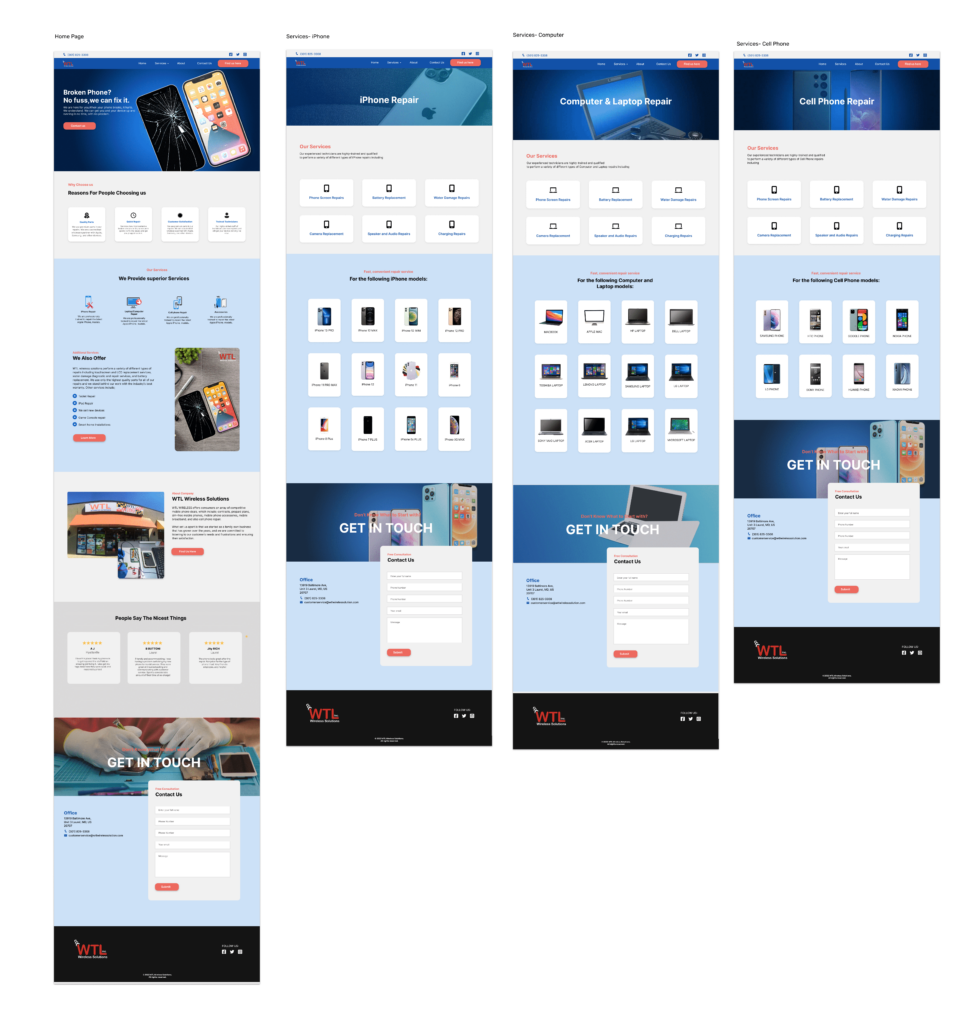
Seamless prototype for a usability test.
I continue to improve the website based on feedback from the team and their customer service reps. I continuously study customer behavior and browsing patterns, gather analytical information, and then update the site regularly to create a better customer shopping experience.