What is Screeb? It is a screen-time-tracking app I researched and designed so users could be more focused and productive.
Timeline: 4 Weeks.
Tools: Figma, Pen & Paper, Photoshop, Miro, Zeplin, Microsoft word.
Over 50% of Americans aged 23-38 are addicted to social media. – Statista Research.
This has a negative impact on their real-life relationships and academic achievement among those still in an educational setting.
Conducting user interviews and research, paper and digital wireframing, low and high prototyping, conducting usability studies, accounting for accessibility, and iterating designs
The goal of the interview is to learn about the behavior of everyday phone users and to understand how they are interacting with the social media platforms that take away their time. And to know what they would rather do differently. Based on the user interview I conducted, I was able to gather these insights:
Participants want an app with features that could set limits, block notifications from social media.
Participants have tried at least once to reduce their excessive phone use habit without success
Phone users want to be conscious of their phone use.
After conducting the interview, I deployed a survey to a variety of platforms (Facebook group, WhatsApp group, Discord). My goal was to understand users’ behavior on a large scale. I got a total of 37 respondents.
Based on the user interview and persona, I identified three main goals that the product should achieve.
To provide users with a clear and easy-to-use experience by learning their phone use habits.
To help users stay off their devices to be more productive.
To help users have more time to pursue their goals like preparing for exams, starting a project, relaxing, and reading a book.
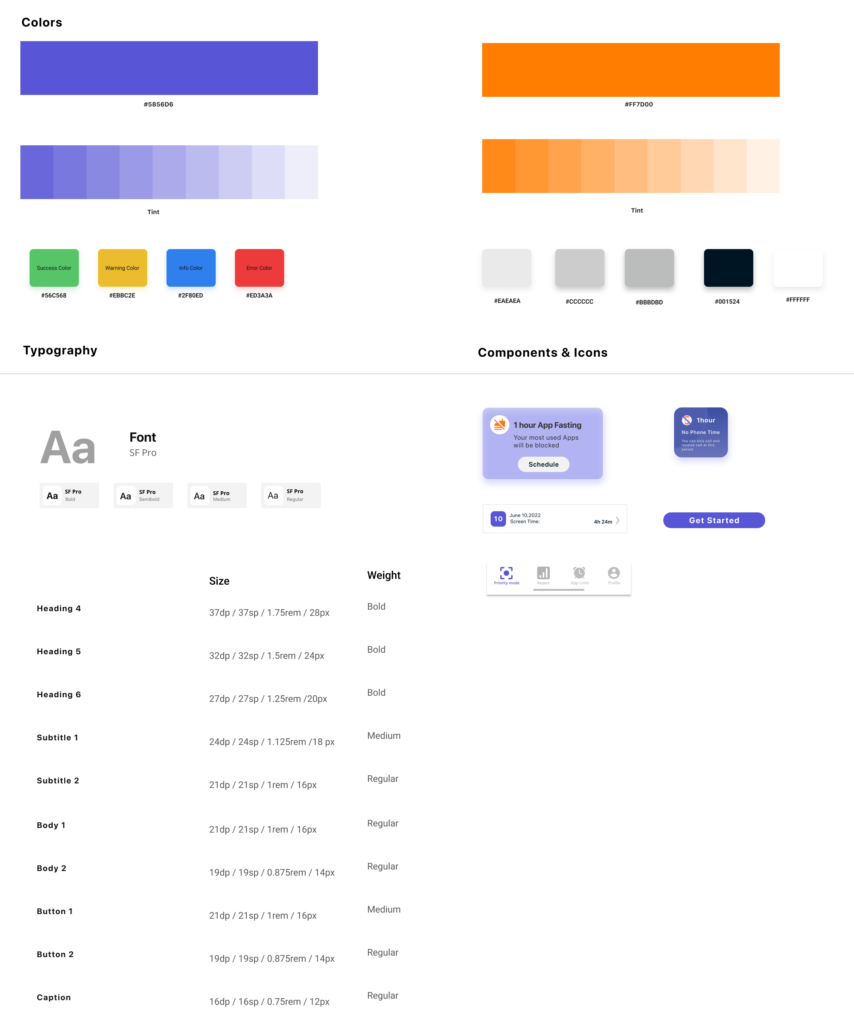
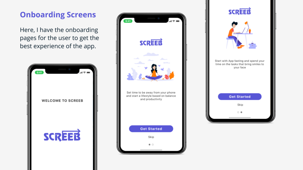
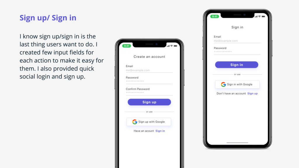
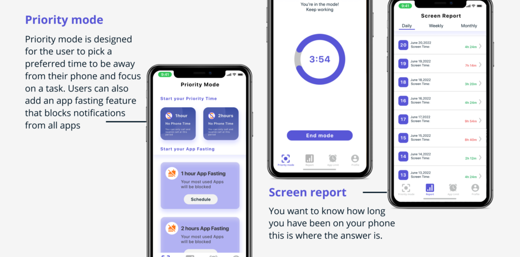
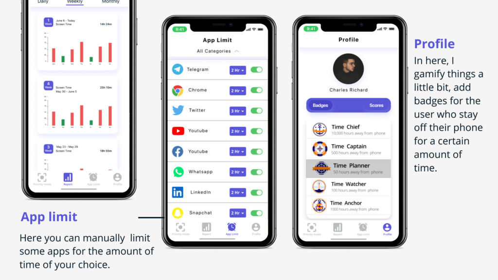
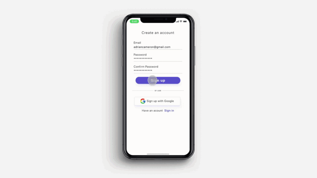
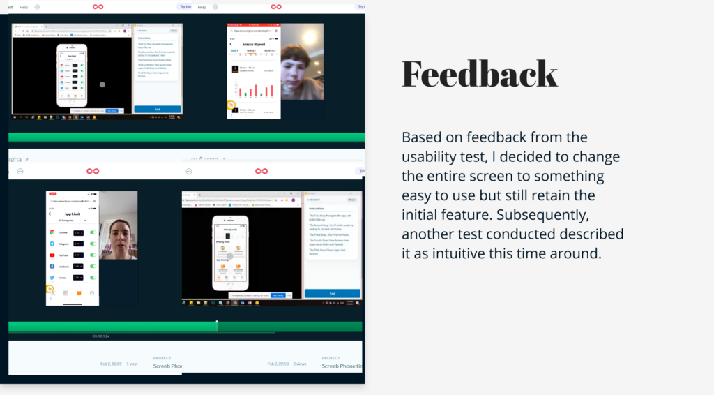
These are the insights I got from conducting Usability studies with five participants.
The interface is well designed and mostly functional.The clickable elements and the navigation worked
The prototype transition is smooth and interactive
Participant understand all the features except the priority mode feature.
70% of participants find Priority mode kind of confusing so I decided to iterate it.
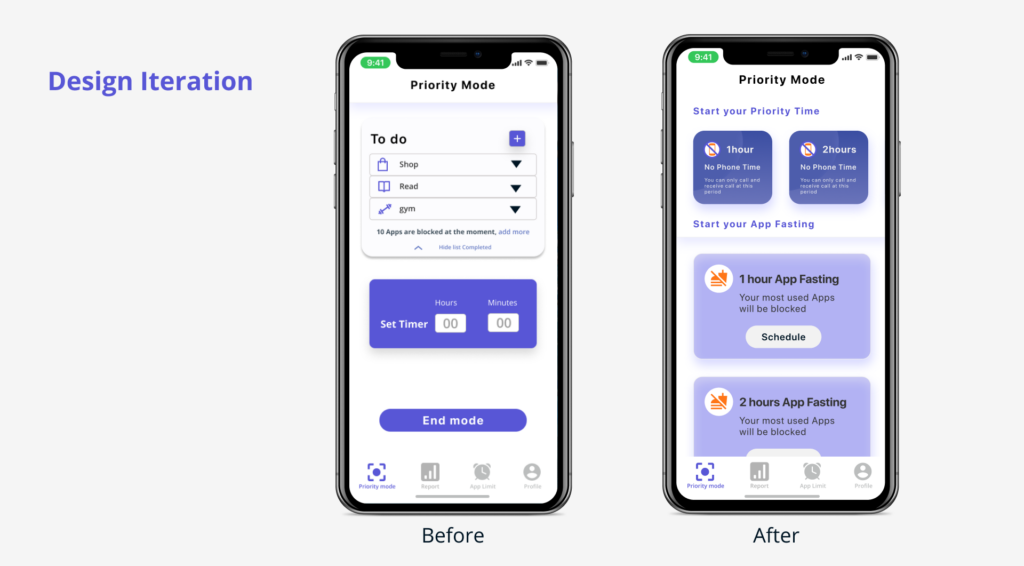
Screeb app aims to ensure users are more productive in their day to day activities by prioritizing task and forming a good habit of staying off their phone. In the beginning, I only had a narrow idea of creating an app to help limit social media use but by conducting user research and deploying design thinking. I was able to understand the user’s needs. In the end, I was able to identify a better MVP, which I see as the minimum set of features that satisfies a given problem.
I am happy with the outcome of this project, and I think there is still a room for improvement.